Machine Generated Images vs Photoshop
- Malin Freeborn
- July 2, 2025
I grew up with people questioning whether you can be a real artist and still use Ctrl+z.
Before that, people probably wondered if digital photography was ‘real photography’.
My generation feels deep suspicion towards any kind of ’not-real-art’ arguments.
Now Chatbot9000 has flooded the web with saccharine kittens and uncanny valley boobs, and they’re clearly ’not actually art’, but it’s hard to say why.
So here is why I say these images are not real art.
They are not designed, nor planned, and cannot represent anything.
To illustrate, I’m going to reuse all the images from my article on Machine Learning Art from two years ago.
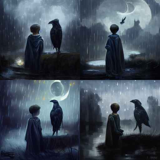
I wanted an image with a number of things:
- A vampiric child - i.e. a child who looks a bit pale, with that ‘bowl haircut’.
- The kid was sitting with his feet dangling out of a window.
- The floor below is an active tavern.
- He has a pet raven by his side.
- He has a permanent, and insincere grin, like he’s left something rotten in your backpack, and he’s waiting for you to find out.
- And of course, it’s night, because he is a vampiric little brat.
- Images should be landscape, and very wide.
- Images should have dark colours with a Gothic feel.
- It should look professional, and interesting.
Anyone can draw an image like this. Anyone with a lot of practice can draw the image well. They can make it look sexy, and smooth. They can make the image enticing, and fit a theme or mood.
Machines cannot portray any of this. They still cannot represent things. It’s hard to spot, because they can make the thing look sexy, and smooth. They can make it enticing. So we get bamboozled, and miss the most important point: they still cannot show anything.
Unsexy Images
I am not an artist. I practised drawing almost every day for over ten years, but I never developed much skill. My images are not sexy, smooth, or enticing. But anyone can draw, so when I needed an image for a game, I drew it.

The image had to convey a lot of ideas:
- The style should be sort-of ‘in-world’, like the Bayeux Tapestry.
- One cave path ends in a sheer drop, down to a river.
- Another path has a hastily-build shoddy bridge which leads to two paths.
- The first path is a narrow crack, difficult for an adult human to fit through.
- The second path has a cairn for a dead budgie, and goblin poop.
- Further down, the second path has a deadly gas.
- Images should be landscape, and very wide.
- Images should be black and white.
- It should look professional, and interesting.
The final images lacks style. I’d say it’s a cave-man doodle, but the cave-paintings I’ve seen are still sexier than the crap I draw. But it gets the job done.
Machines Making Art
For the next adventure module, I tried using Inkscape and a bunch of public domain silhouettes. The image had to convey a lot:
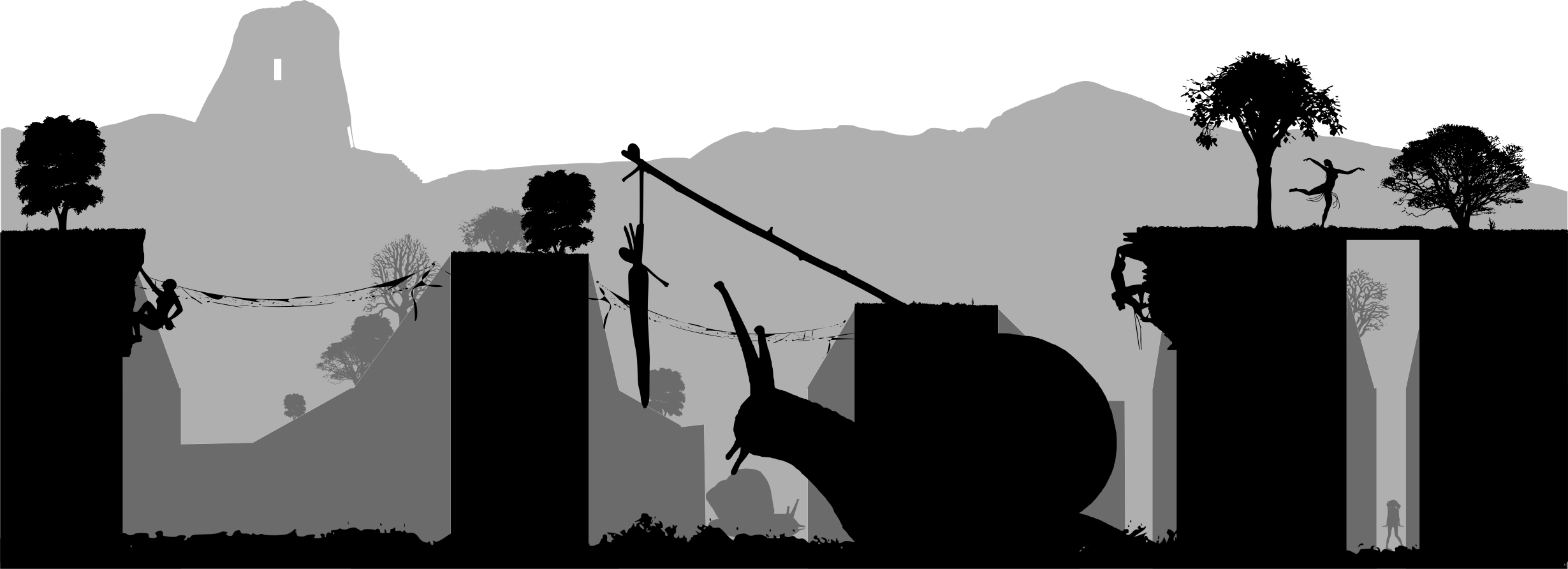
- In the far distance, a broch stands on a hill.
- The forest’s floor here has been sundered, creating dry ditches.
- Elves live on the upper grounds, with vine bridges stretching between plateaus.
- The upper regions have vegetation.
- But the elves have to climb down sometimes.
- In the ravines, giant snails roam.
- Sometimes the giant snails are guided by vegetables on sticks.
- Images should be landscape, and very wide.
- Images should be black and white.
- It should look professional, and interesting.
The final product was ‘made with a computer’, perhaps more than the earlier cave image (though both were made with a computer). This image has a little more style. It looks a little more ‘sexy’. But this isn’t skill - perhaps it’s ‘stolen valour’, because I didn’t make these images. I just stitched them together. But none of that matters, because the image conveys the idea. You can see the snails.
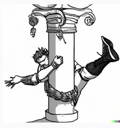
Compare that to the image of the ghouls I needed:
- Ghouls lie under knee-high water.
- They’re chained by the neck to pillars.
- If they pull on their chains, the pillars will collapse.
- Once people open the double-doors, the ghouls will stand up, and move towards them.
- At the far end of the room, a magical gateway sits (currently inactive).
- In the background, a section of the wall has loose bricks, indicating a hidden entrance.
- The ghouls have sat here in peat-filled water for centuries, and look like bog mummies .
- Images should be landscape, and very wide.
- Images should be black and white.
- It should look professional, and interesting.
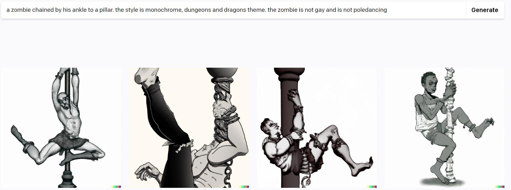
From afar, the image looks okay. The more you look, the stranger it gets, but that’s not the problem I have with any of this.
This isn’t ‘just like Photoshop all over again’, because machines cannot depict anything more than ‘a dog’. You can’t design an image with this software.